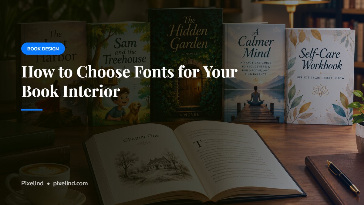
Readers rarely notice a well-chosen font, but they always notice a bad one. Your interior fonts affect how easy your book is to read and how professional it looks.
Body text: choose a classic serif
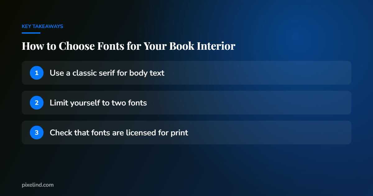
Most printed books use a serif font for body text. Serifs, the small strokes at the ends of letters, help guide the eye along long lines of text. Popular book fonts include Garamond, Minion, Caslon and Baskerville-style typefaces.
Headings: add personality, carefully
Chapter titles are where you can reflect your genre: an elegant script for romance, a bold sans-serif for a thriller, something playful for children’s books. Keep it readable, and use it consistently.
Limit yourself to two fonts
One font for body text and one for headings is usually enough. Using many fonts makes a book look homemade.
Size and spacing
- Body text in printed books is commonly set around 10–12 pt, depending on the font and trim size.
- Comfortable line spacing (leading) is usually a little larger than the font size.
- Avoid very long lines. Larger trim sizes may need wider margins or a larger font.
Justified text and hyphenation
Most books use justified text, aligned on both sides. Good justification needs careful hyphenation and spacing control, otherwise you get “rivers” of white space running down the page.
Licensing and embedding
Make sure your fonts are licensed for commercial print use. Print platforms like Amazon KDP also require fonts to be embedded in your PDF.
Don’t forget the eBook
In most Kindle eBooks, readers choose their own font. Your print font choices won’t carry over, so focus on clean structure and headings in the eBook instead.
Want a book that looks professionally published?
We format interiors and design covers by hand, ready for print and eBook.
See our formatting service, request a free sample or book a free 30-minute call.