Readers really do judge a book by its cover. On Amazon, most people first see your cover as a small thumbnail in a list of search results, and they decide in seconds whether to click. Here are seven common mistakes that make self-published books look amateur, and how to avoid them.
1. It fails the thumbnail test
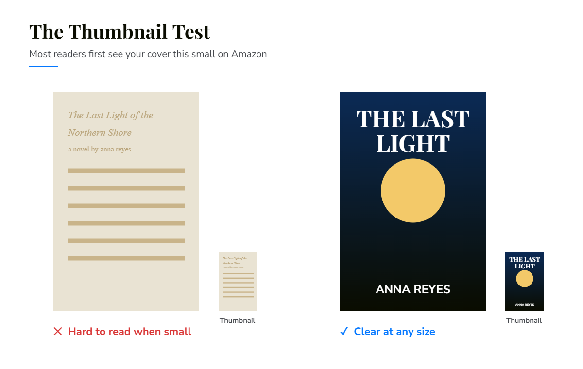
A cover that looks great full-size can become unreadable when shrunk. Thin fonts, long titles and busy details disappear at thumbnail size.
The fix: shrink your cover to the size of a postage stamp. Can you still read the title and recognise the image? If not, simplify.
2. It ignores genre conventions
Every genre has a visual language. Thrillers often use bold type and dark, high-contrast images. Romance tends towards warm colours and couples or script fonts. Self-help leans clean and bright. A cover that ignores these signals confuses readers about what your book is.
The fix: study the top 20 books in your category and notice what they have in common. Fit in enough to signal your genre, then stand out with quality.
3. Too many fonts, or the wrong ones
Using four different fonts, or decorative fonts that are hard to read, is one of the quickest ways to look homemade.
The fix: use one or two well-chosen fonts, with strong contrast between title, subtitle and author name.
4. A cluttered design
Trying to show every character, theme and plot point on the cover leads to visual noise.
The fix: build the cover around one strong idea or image that captures the mood of your book.
5. Low-resolution images
Images that look fine on screen can print blurry or pixelated.
The fix: use high-resolution, properly licensed images, at 300 DPI for print.
6. The wrong spine or template
A print cover is one file: back cover, spine and front cover. The spine width depends on your final page count and paper type, so a cover built for the wrong page count won’t fit. On Amazon KDP, your book must have at least 79 pages to include text on the spine.
The fix: finalise your interior first, then build the cover from KDP’s cover template for your exact trim size, page count and paper.
7. Forgetting the back cover
The back cover matters when readers pick up a printed copy. A missing or weak blurb, or text placed where the barcode goes, looks unprofessional.
The fix: include a short, compelling blurb, an author photo or bio if it suits your genre, and leave clear space for the barcode.
Want a cover that sells?
We design covers by hand that fit your genre, stand out at thumbnail size and meet KDP and IngramSpark print requirements.
Explore our cover design service or book a free 30-minute call.